Weekly S&P500 ChartStorm - 13 March 2022
Callum Thomas
Head of Research at Topdown Charts - Global Economics & Asset Allocation research
The Weekly S&P500 ChartStorm is a selection of 10 charts which I hand pick from around the web and post on Twitter. The purpose of this post is to add extra color and commentary around the charts.
The charts focus on the S&P500 (US equities); and the various forces and factors that influence the outlook - with the aim of bringing insight and perspective...
1. Speculative Futures Positioning: Always a lot of if's and but's when it comes to speculative futures positioning indicators like this (e.g. it might not be representative, or could reflect the other leg of some hedging or long/short trade, etc).
BUT, one thing is *very clear* -- this is not a picture of capitulation.
More evidence for: "feel kinda bearish, but still long".

Source: @CameronDawson
2. Midterm Malaise: One for the "this is normal and healthy" bucket...
It is not unusual to see a large pullback during mid-term years... (and in that destruction the creation of opportunities regularly happens).

Source: @RyanDetrick
3. The Stockmarket *is* The Economy: Recessions expose the weak spots, destroy unsustainable models, and crush earnings. How this current stockmarket correction resolves (e.g. down then back to bull, vs down and down into bear market mode) will depend powerfully on whether a recession occurs.
(and it seems kinda likely, by my read)

Source: @MichaelAArouet
4. Bear Market History: Another table, basically a Friendly Reminder of what bear markets look like. (p.s. I wouldn't call covid a bear as such, it was a crash... bears are more sustained downturns in price which tend to be driven/reinforced by crappy macro etc -- rather than "dOwN 20% iS a bEaR mArKet!").

Source: @gnoble79
5. Regime Change? "Downside Volatility" is starting to dominate... a common feature of bear markets.

Source: @exposurerisk
6. Oil Shock: Just as central banks were already beginning to take the punchbowl away, oil comes in and dumps all over the earnings/economic outlook. To be absolutely clear (and the chart kind of speaks for itself): the surge in oil prices is a headwind to economic growth, earnings, and the stockmarket.

Source: @MrBlonde_macro
7. Energy Tho: Albeit, energy is of course a very different story.
(“stockmarket” vs market of stocks)

Source: @mark_ungewitter
8. European Equity Exodus: European equities (understandably given direct geopolitical risk, not to mention indirect/direct economic + financial spillover risk) have been *heavily* sold... much much worse than during the pandemic panic.

Source: @MikeZaccardi
9. Also European Equities... Pockets of value out there, especially relative value.

Source: @ayeshatariq
10. The Theme Age.

Source: @jessefelder
BONUS CHART >>
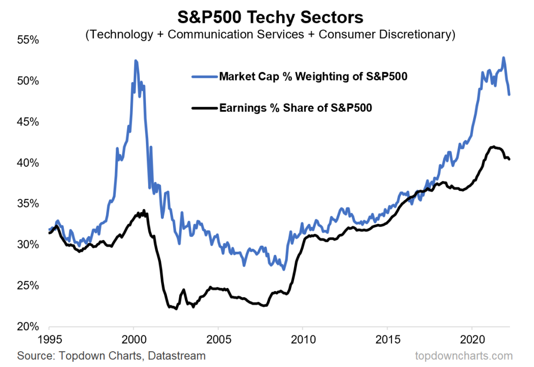
The Rise and (?) of Tech: The market cap weighting of the tech and tech-related sectors has peaked, and its share of S&P 500 earnings has also begun to fall.
This chart shows the market cap weight + earnings share/weight in the S&P 500 of the Techy Sectors (after the big reclassification of 2018 which saw a bunch of tech stocks get rebranded into other sectors (thanks GICS), I felt it necessary to re-clump these back into a sort of super-sector).

Anyway, in many respects the chart kind of speaks for itself.
Yes, it is not dot-com/2000 in many respects, but there are many echoes. Probably the main takeaway is that it looks like the Techy Sectors have reached an upper limit in terms of earnings and market share domination of the S&P500, at least for now.
As for the why, it is important to highlight that the Techy Sectors group got a big one-off surge in growth when the pandemic forced a step-shift in a bunch of existing trends (e.g. online vs brick and mortar, work from home, small town vs big city, etc).
Meanwhile the other parts of the market took a big one-off hit as the real economy stopped and commodities crashed. That is changing now, at least and especially on the commodities and capex front.
This chart is therefore meaningful when it comes to the issue of rotation and sector allocations, but also in terms of the overall “stockmarket“ (i.e. the typical market-cap weighted index)… there were some clear excesses/pockets-of-stretch that likely need to be corrected through time and space(price).
Thanks for reading!
Callum Thomas
Founder and Head of Research at Topdown Charts
Feedback/questions/views welcome in the comment section below:
The world is full of opportunities. Financial markets never stay the same. Formerly Founder and CEO Advanced Dynamic Asset Management
2yThe large question remain, will just the valuations collapse or also the earnings?