
Making sense of data: Spotlight on data in social media
Making sense of data: Spotlight on data in social media is the sixth in a series, presented by our partner SAS, exploring the role of data in understanding our world. SAS is a pioneer in the data management and analytics field.
Like infographics, social media and other forms of user-generated content pose unique challenges regarding data. Many news outlets and journalists have checks and balances in place to ensure that information reported (especially information based on data) is as accurate as possible. But those same checks and balances do not hold true for those creating and sharing content. Social media gives user-generated content a wider reach and greater influence than ever before. Sharing content on social media poses additional challenges. For example, it can be difficult to identify the original source, and consequently, its credibility. In this post we’ll examine common issues that arise with user-generated and shared social content.
Social media posts are often criticized for allowing users to share pieces of information without putting it in context. This is particularly problematic with data. While the numbers and charts may represent real information, the reader needs context to interpret information correctly. Readers may inadvertently share questionable charts or statistics because social media platforms make it easy to do so. Images of graphs and charts pulled from research articles can quickly be shared without citing the source. These images might then circulate widely without context.
Intended for sharing
Even thoughtfully designed charts and graphs taken out of context can be problematic, but what happens when content is designed specifically for social media? Authors of social content know that readers often prefer brief messages instead of a large amount of information. Knowing shorter content is more likely to quickly spread to a wider audience, authors may intentionally design their social posts with content that will catch the eye of the audience they wish to reach.
In earlier posts, we’ve discussed features that can make data and data visualizations hard to interpret correctly. Whether it’s logarithmic scales or truncated axes, we’ve seen how these may make data easier to read, but may unintentionally cause readers to draw inaccurate conclusions. While these mistakes are often unintentional, some users may intentionally manipulate visualizations to reinforce a specific point of view.
A fresh look
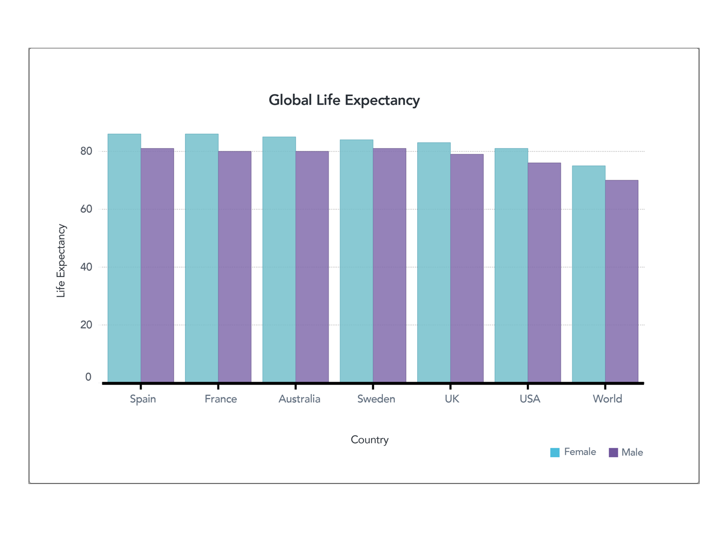
Figure 2. Global Life Expectancy (full axis) World Bank (male) World Bank (female)
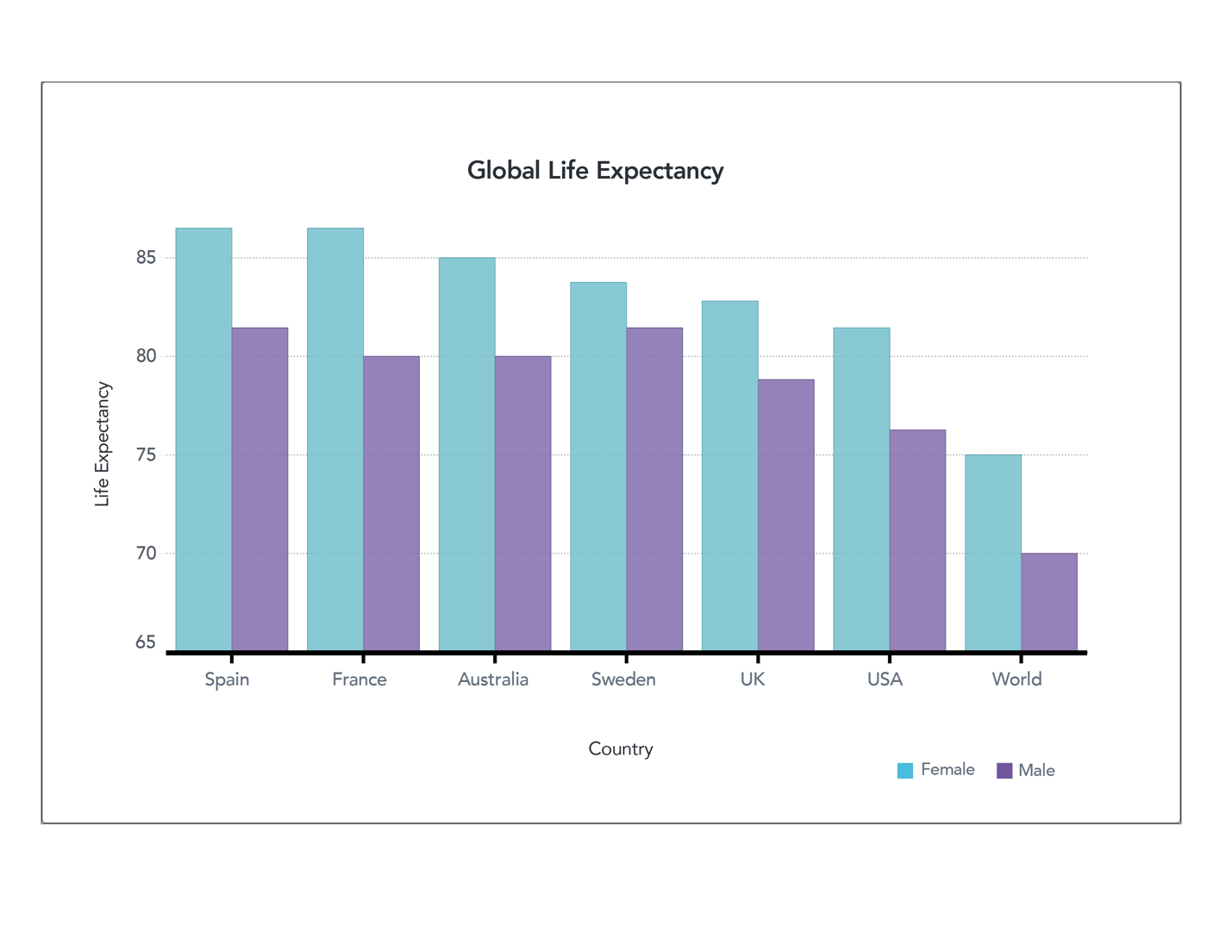
Figure 1. Global Life Expectancy (truncated axis) World Bank (male) World Bank (female)
Let’s take another look at some of the data we examined before. These two charts show life expectancy in different countries. We demonstrated how truncating the axes allow you to see the differences in data, but also might lead readers to view those differences as more significant than they really are. Now suppose this isn’t an honest mistake, and the author wanted to create content to convince you of something – perhaps that you should move to France to live longer. If that were the case, the author might create a chart like the one below.
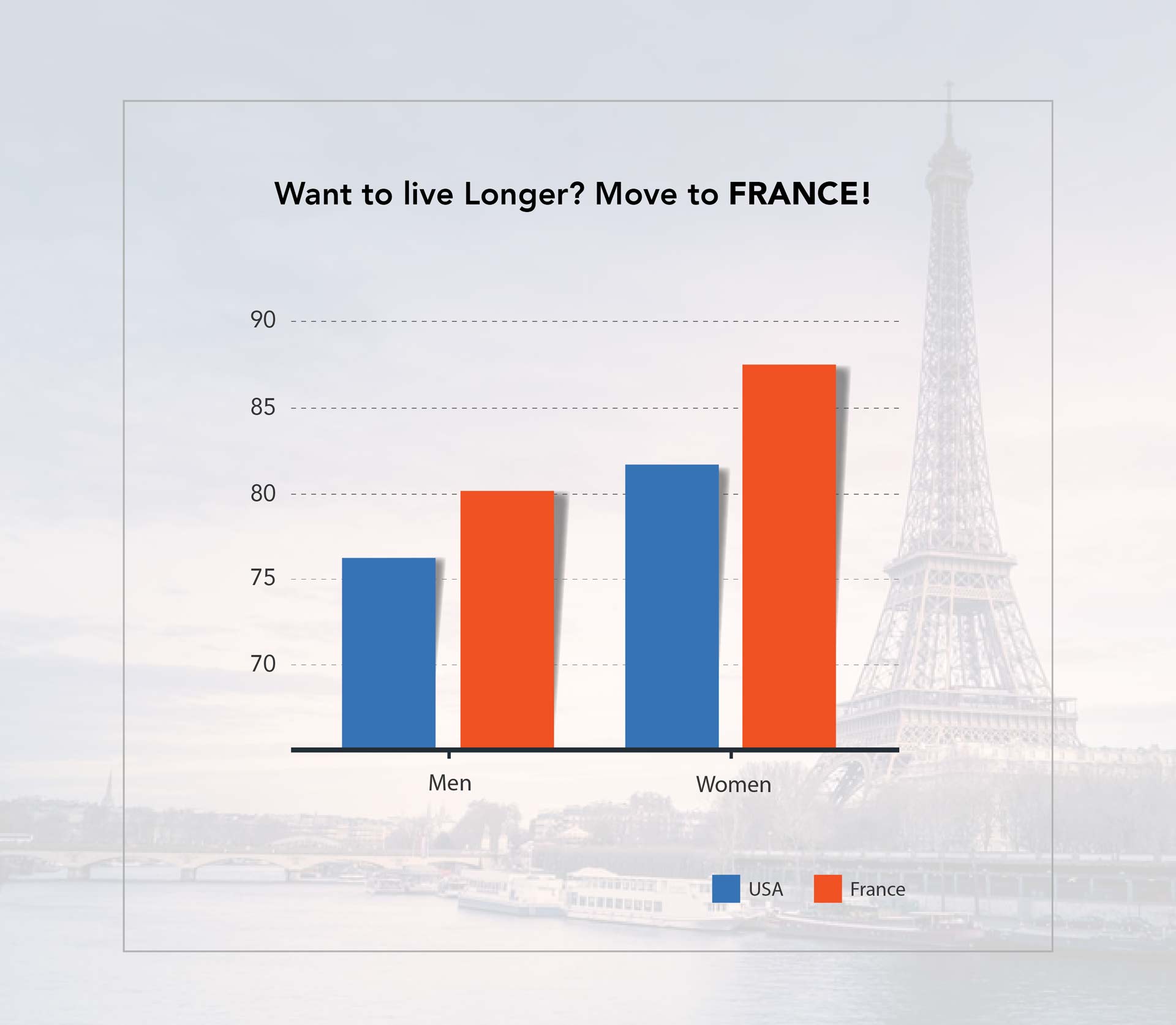
Figure 3. Life Expectancy Social Media Post
Does this seem like something you might see on your social media feed? The is the same data as in previous charts, but it’s been heavily manipulated so that you focus on what the author wants you to see. First, it includes a large title with the conclusion the author wants you to make – that moving to France will lead you to live a longer life. It doesn’t mention that this is solely the life expectancy of the country’s residents. A variety of cultural and lifestyle factors come into play, and would not apply if you simply move to a place. Also, removing gridlines and shrinking the size of the font showing age makes it harder to read the scale of the data. The choice of colors also further conveys the purpose — implying that the U.S. is worse than France.
Manipulating data to make a point
Let’s take a look at another chart. Here’s data from the same source, presented two different ways.
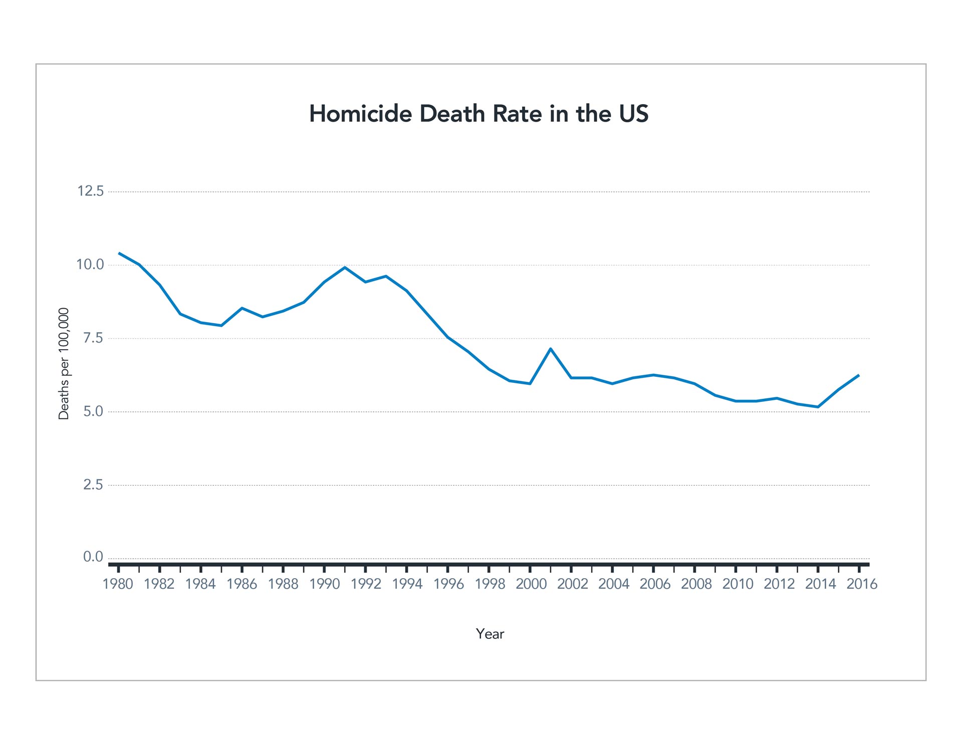
Figure 4. Homicide Rate Line Chart CDC
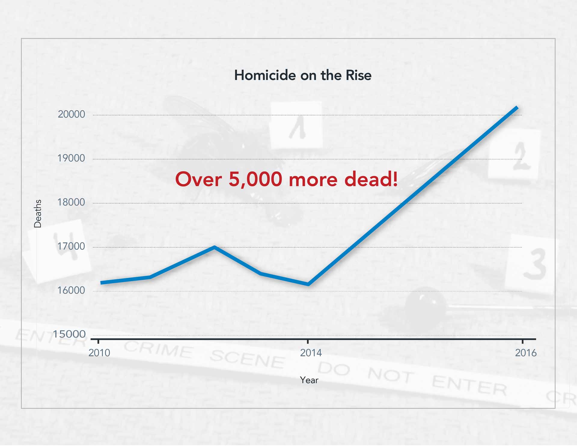
Figure 5. Homicide Rate Social Media Post CDC
The first shows the death rate by homicide relative to the population. It charts the rate over 36 years and indicates a mostly steady decline. Despite some bumps and dips, but overall, the trend is downward. However, look how the data can be manipulated to prove a specific point. The second graph uses a different unit, the raw number of homicides each year. It dos not average it out as population increases. The scale of years also is manipulated slightly. The first half of the graph represents four years, while the second half represents only two years. However, this isn’t brought to the reader’s attention. The axes are truncated, and the width is even reduced to further exacerbate the angle of the line. Again, the chart has a bold title with a random (and in this case meaningless) statistic tossed in for good measure.
There are many ways to manipulate data to prove a specific point. These graphs are just two examples of the ways people may present data to make a particular point, especially when sharing on social media. If you see a graph like the one above, with a catchy headline and no additional context, take a careful look and see if you can find how the author may have manipulated information to emphasize a point.
Disregard suspect data
It is challenging and sometimes impossible to conduct further research on social media posts or find the source or context of data presented. If you can’t find a reputable source that provides this context, it’s best to ignore the information. Approach it as an opportunity to be a responsible consumer of data — don’t share or “like” such posts! If you’re particularly curious about a point being made, see if you can find your own data to back it up and perhaps create your own content in a thoughtful, context-driven way.
To learn more see Diving into charts and graphs in the news or our full list of related articles below.
Test yourself: Take our data quiz (here or below)!
Related articles:
- 6 Strategies for making sense of data in the media
- Diving into charts and graphs in the news
- Exploring statistics in the media
- Understanding complications with data collection
- Evaluating claims made from data
- Special look at issues with infographics
- How to be savvy about data in the news
- Quiz: Can you make sense of data?
powered by Typeform
![]() About SAS: Through innovative analytics software and services, SAS helps customers around the world transform data into intelligence.
About SAS: Through innovative analytics software and services, SAS helps customers around the world transform data into intelligence.