Money
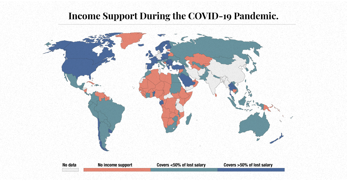
Mapping Global Income Support During COVID-19
Mapping Global Income Support During COVID-19
Income loss has impacted many during the COVID-19 pandemic. Unemployment, reduced hours, office closures, and business shutdowns have prompted the need for mass income support.
Globally, income from work fell $3.5 trillion in the first nine months of 2020, a change of -10.7% compared to the same period in 2019.
In the above map, Our World in Data reveals the different levels of income support provided by governments across the globe.
Income support, in this case, is defined as governments broadly covering lost salaries, or providing universal basic income or direct payments to people who have lost their jobs or cannot work. Levels of income support are changing over time.
Small Government
Many world governments have provided no support when it comes to a universally applicable scheme to cover lost income in their countries.
Examples: (as of January 25th, 2021)
- 🇻🇪 Venezuela
- 🇸🇾 Syria
- 🇧🇾 Belarus
- 🇧🇩 Bangladesh
- 🇰🇭 Cambodia
The majority of the governments providing no support are in low to lower-middle income countries. Based on a recent report from the International Labour Organization (ILO), lower-middle income countries have also seen the highest income losses, reaching 15.1% since 2019.
Developing countries tend to experience a significant fiscal stimulus gap, in which they do not have the capacity to cushion lost income or lost jobs. In fact, it’s estimated by the ILO that low and lower-middle income countries would need to inject an additional $982 billion into their economies to reach the same level of fiscal stimulus as high income countries.
A Helping Hand
There are other governments that are giving out some help on a wide-scale basis, providing citizens less than 50% of their lost salaries:
Examples: (as of January 25th, 2021)
- 🇿🇦 South Africa
- 🇨🇳 China
- 🇷🇺 Russia
- 🇹🇭 Thailand
- 🇦🇺 Australia
South Africa’s unemployment rate was the highest in the world at 37.0% in 2020, an increase from 28.7% in 2019. Despite having one of the strictest lockdowns, the country has not been able to slow rising case counts or job losses. Now, South Africa is facing another threat, as a new strain of the novel coronavirus has taken hold in the nation.
The Most Supportive Governments
Finally, many world governments have offered higher amounts of income support, providing citizens with more than 50% of lost income:
Examples: (as of January 25th, 2021)
- 🇨🇦 Canada
- 🇺🇸 United States
- 🇬🇧 United Kingdom
- 🇪🇸 Spain
- 🇸🇦 Saudi Arabia
Regionally, it’s the Americas that have been hit the hardest, according to the ILO. The region experienced a 12.1% drop in labor income in 2020 compared to 2019, revealing the need for broad-based income support.
U.S. unemployment went from 3.7% to 8.9% between 2019 and 2020. While the American government initially provided support in the form of the CARES Act, the policy response was recently extended through the more recent $900 billion relief deal.
Income Support Post COVID-19
While some countries have not been in extreme need of income support, others have been and haven’t received it. When looking at demographics, the hardest hit workers have been temporary workers, migrant workers, care workers, and self-employed vendors who have no labor contracts or employment insurance.
As a result, some critics have used this as an opportunity to call for universal basic income (UBI). A three-year study is already being implemented in Germany, for example, to test out how effective this kind of income support would be in the post-pandemic period.
Today, however, income is not a guarantee, and while in 2021 things may be returning to ‘normal,’ that does not mean that income levels will go back to normal.


Money
How Debt-to-GDP Ratios Have Changed Since 2000
See how much the debt-to-GDP ratios of advanced economies have grown (or shrank) since the year 2000.


How Debt-to-GDP Ratios Have Changed Since 2000
This was originally posted on our Voronoi app. Download the app for free on Apple or Android and discover incredible data-driven charts from a variety of trusted sources.
Government debt levels have grown in most parts of the world since the 2008 financial crisis, and even more so after the COVID-19 pandemic.
To gain perspective on this long-term trend, we’ve visualized the debt-to-GDP ratios of advanced economies, as of 2000 and 2024 (estimated). All figures were sourced from the IMF’s World Economic Outlook.
Data and Highlights
The data we used to create this graphic is listed in the table below. “Government gross debt” consists of all liabilities that require payment(s) of interest and/or principal in the future.
| Country | 2000 (%) | 2024 (%) | Change (pp) |
|---|---|---|---|
| 🇯🇵 Japan | 135.6 | 251.9 | +116.3 |
| 🇸🇬 Singapore | 82.3 | 168.3 | +86.0 |
| 🇺🇸 United States | 55.6 | 126.9 | +71.3 |
| 🇬🇧 United Kingdom | 36.6 | 105.9 | +69.3 |
| 🇬🇷 Greece | 104.9 | 160.2 | +55.3 |
| 🇫🇷 France | 58.9 | 110.5 | +51.6 |
| 🇵🇹 Portugal | 54.2 | 104.0 | +49.8 |
| 🇪🇸 Spain | 57.8 | 104.7 | +46.9 |
| 🇸🇮 Slovenia | 25.9 | 66.5 | +40.6 |
| 🇫🇮 Finland | 42.4 | 76.5 | +34.1 |
| 🇭🇷 Croatia | 35.4 | 61.8 | +26.4 |
| 🇨🇦 Canada | 80.4 | 103.3 | +22.9 |
| 🇨🇾 Cyprus | 56.0 | 70.9 | +14.9 |
| 🇦🇹 Austria | 65.7 | 74.0 | +8.3 |
| 🇸🇰 Slovak Republic | 50.5 | 56.5 | +6.0 |
| 🇩🇪 Germany | 59.3 | 64.0 | +4.7 |
| 🇧🇪 Belgium | 109.6 | 106.8 | -2.8 |
| 🇮🇱 Israel | 77.4 | 56.8 | -20.6 |
| 🇮🇸 Iceland | 75.8 | 54.6 | -21.2 |
The debt-to-GDP ratio indicates how much a country owes compared to the size of its economy, reflecting its ability to manage and repay debts. Percentage point (pp) changes shown above indicate the increase or decrease of these ratios.
Countries with the Biggest Increases
Japan (+116 pp), Singapore (+86 pp), and the U.S. (+71 pp) have grown their debt as a percentage of GDP the most since the year 2000.
All three of these countries have stable, well-developed economies, so it’s unlikely that any of them will default on their growing debts. With that said, higher government debt leads to increased interest payments, which in turn can diminish available funds for future government budgets.
This is a rising issue in the U.S., where annual interest payments on the national debt have surpassed $1 trillion for the first time ever.
Only 3 Countries Saw Declines
Among this list of advanced economies, Belgium (-2.8 pp), Iceland (-21.2 pp), and Israel (-20.6 pp) were the only countries that decreased their debt-to-GDP ratio since the year 2000.
According to Fitch Ratings, Iceland’s debt ratio has decreased due to strong GDP growth and the use of its cash deposits to pay down upcoming maturities.
See More Debt Graphics from Visual Capitalist
Curious to see which countries have the most government debt in dollars? Check out this graphic that breaks down $97 trillion in debt as of 2023.

-

 Real Estate2 weeks ago
Visualizing America’s Shortage of Affordable Homes
-

 Technology1 week ago
Ranked: Semiconductor Companies by Industry Revenue Share
-

 Money1 week ago
Which States Have the Highest Minimum Wage in America?
-

 Real Estate1 week ago
Ranked: The Most Valuable Housing Markets in America
-

 Business1 week ago
Charted: Big Four Market Share by S&P 500 Audits
-

 AI1 week ago
The Stock Performance of U.S. Chipmakers So Far in 2024
-

 Misc2 weeks ago
Almost Every EV Stock is Down After Q1 2024
-

 Money2 weeks ago
Where Does One U.S. Tax Dollar Go?