
Lauren Gardner
Johns Hopkins University
For creating the Covid-19 Dashboard, which set a new standard for disseminating authoritative public health data in real time
The 2022 Lasker~Bloomberg Public Service Award honors Lauren Gardner (Johns Hopkins University) for creating the Covid-19 Dashboard, which set a new standard for disseminating authoritative public health data in real time. By launching this global Covid-19 surveillance tool, she provided accessible and reliable information about the spread of an emerging infectious disease, thereby filling a void in the international public health system and establishing a model to emulate. This trailblazing resource lit a path toward informed policy guidelines and personal choices amidst a morass of misinformation.
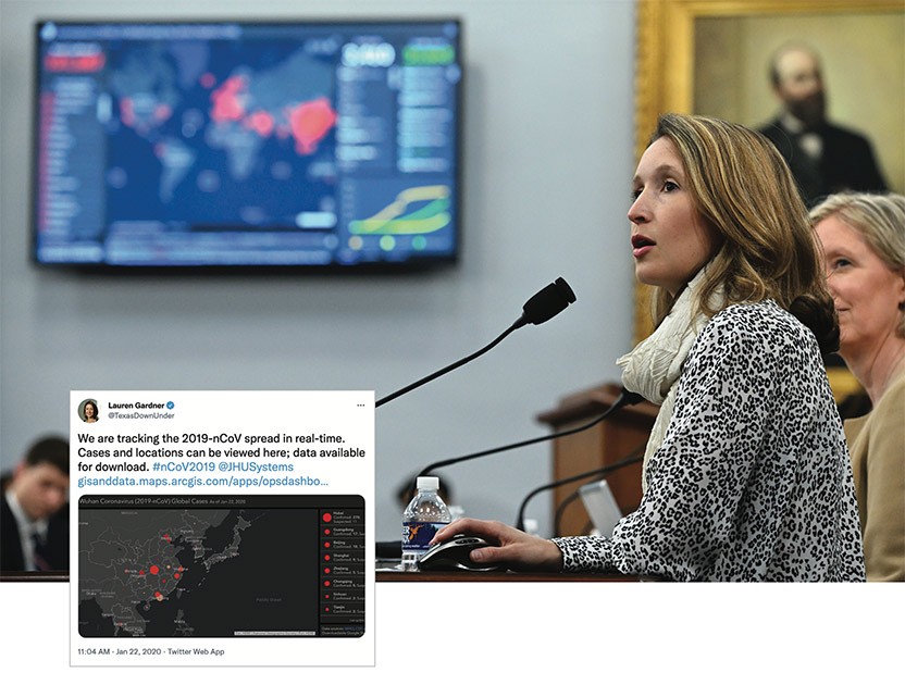
Testifying before Congress and the tweet that announced the Covid-19 Dashboard
Gardner, trained as a transportation engineer, studies how people’s behavior, among other factors, influences disease transmission. On January 21, 2020, she met with graduate student Ensheng Dong to discuss how vaccine hesitancy was driving measles risk. He mentioned that he had been tracking cases of the disease now known as Covid-19 back home in China. Realizing that the situation posed an unusual opportunity to follow an infectious disease outbreak from the beginning, they decided to collect data and make it accessible through an intuitive and interactive interface. Gardner thought that members of the research community would find it useful. She did not imagine that the illness would engulf the planet or that her fledgling project would provide a lynchpin in individual and institutional responses to the deadly scourge.
A bright idea for research, a golden idea for humanity
Gardner and Dong worked through the night to build a prototype, deploying visualization software developed by a company called Esri. Red dots, whose sizes represented the number of cases—322 total—peppered a map of Asia. Gardner tweeted an invitation: “We are tracking the 2019-nCoV spread in real-time. Cases and locations can be viewed here; data available for download.”
With those words, she instigated a revolution in public health reporting. As the dots swelled in number, size, and global distribution, the tool went viral on social media, and people feverishly mined the data. Initially, the dashboard and its underlying data resided in Dong’s personal Google drive, but when too many people tried to access it simultaneously, the system crashed. The team moved the resource to GitHub, an internet-based data repository service that also incorporates communication and documentation capabilities. By the end of the month, the resource had received more than a billion requests for information.
At first, the dashboard displayed only cases; two weeks later, the scientists added deaths and recoveries. Eventually, they included other variables such as testing, hospitalization—and vaccines too, after those became available (Lasker~DeBakey Clinical Medical Research Award, 2021). Recovery, testing, and hospitalization data were eventually removed due to lack of reliable sourcing.
When Gardner introduced the dashboard, no other institution was providing this information. The World Health Organization, for instance, created daily summaries, but the data within were not easily extractable for analysis as they resided in downloadable PDFs. Yet timely, accurate, and obtainable information was crucial to craft nimble and rational strategies for combating the mushrooming plague.
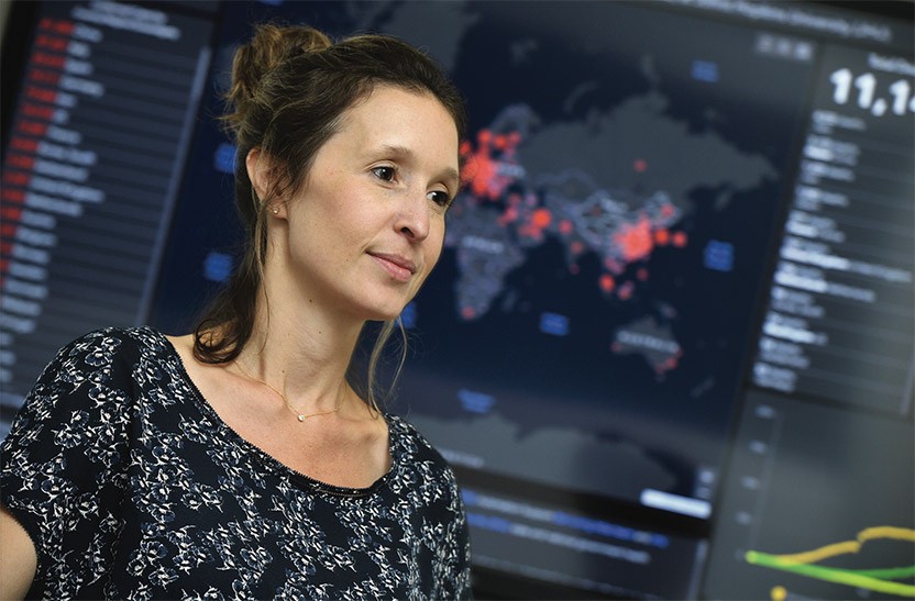
Gardner with the Covid-19 Dashboard
A robust data pipeline
Initially, Gardner’s team relied on DXY.cn, an online community for Chinese medical professionals, that tracks cases by province in China and by country elsewhere, although this website was not promptly reporting cases outside of China. As the virus fanned out, the scientists manually combed unconventional as well as conventional sources—media outlets and Twitter posts by public health officials, for instance. Then the researchers validated their findings with local health departments. As authoritative avenues opened, they replaced the less traditional ones.
At the beginning, Gardner and her students updated the database around the clock, as they became aware of new cases, but as the outbreak exploded into a pandemic, this system became unsustainable. Gardner’s research group at the Center for Systems Science and Engineering and another team that she leads at the Johns Hopkins Applied Physics Laboratory wrote computer programs to automatically “scrape” data from each source. This was no small feat, as definitions of Covid-19 infections and deaths varied, even within the same country. For instance, some locales tallied only test-confirmed Covid-19 cases, whereas others included probable cases. Further complicating matters, jurisdictions altered their protocols over time. Because the scientists were extracting data from overlapping areas, they also ran the risk of overcounting, so they developed rules that dictate which source to choose when more than one is available for a given location.
They also produced anomaly-detection software that flags suspicious jumps or drops and holds back such data while the team investigates whether these sudden deviations are real. Maybe someone inadvertently added a zero to the end of a number or administrators of a source website decided to switch two columns, thus swapping cases and deaths. Counts sometimes plunged because authorities stopped including probable cases or they reviewed a batch of death certificates and decided that some individuals died not from Covid-19, but rather, from a comorbidity. Perhaps a testing center processed a backlog of results, producing what looked like a single-day spike when the tabulation represented months of data.
Gardner’s team vets each piece of questionable data, ferreting out reasons for sudden surges or dips. Only after validating it do they publish it in GitHub, which feeds the map. Through this quality control mechanism, errors minimally propagate to the dashboard.
As of July 2022, these computer programs are harvesting numbers of cases, deaths, and vaccinations every hour from more than 3500 locations—down to the county level in the U.S. By early 2022, the dashboard had been queried hundreds of billions of times.
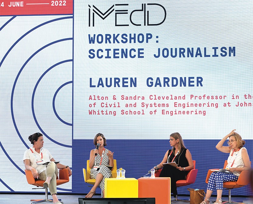
Gardner discusses her Dashboard with science journalists
Information epidemic
By providing snapshots of viral reality, the dashboard has allowed the public, media, policymakers, businesses, and academics to follow the propagation of SARS-CoV2, make informed decisions to mitigate risk, and gauge the success of efforts aimed at combating the contagion. This resource became increasingly crucial amidst a proliferation of misinformation as elected officials at the highest level of government too often spouted dangerous nonsense.
The dashboard is a centerpiece in situation rooms around the world. News outlets draw upon the GitHub repository to show the virus’s trajectory and hotspots, and its data has underpinned myriad research projects. For example, combining localized information with demographic data has illuminated gaping disparities in rates of disease spread and health outcomes with respect to race and income.
Eventually, many institutions, municipalities, and countries built their own dashboards, but the spatial resolution of Gardner’s stands unrivaled among the large data aggregators. It remains the gold standard epidemiological record of the pandemic and will continue to serve a crucial purpose as people study Covid-19 retrospectively and develop approaches to public health data collection, monitoring, and display.
Through her visionary work, Gardner conceived and launched a trailblazing enterprise that has enabled the world to watch, for the first time, a pandemic’s course as it unfolds, and she has bound future health crises to this benchmark. She has forged a new expectation for readily accessible information that is timely, detailed, and accurate—and that allows members of society to map their behavior to real health data rather than relying entirely upon the idiosyncrasies of pundits and political leaders.
by Evelyn Strauss

Building Castles in the Sky and Houses of Cards That Don’t Collapse
The creative process involves two phases—generating new ideas and then focusing on the most tractable and useful ones.

Acceptance remarks, Lauren Gardner
It’s been an exceptional experience to play such an integral role in keeping the world informed during a global public health crisis, and perhaps equally important, changing the expectations around public access to data and information.
I grew up in a very science-minded household, and that experience nurtured my curiosity, and instilled in me a deep appreciation for rational and evidence-based thought. I chose to pursue a PhD in Civil Engineering, specifically on the topic of network modeling, because I always appreciated how seemingly disparate systems were connected, and I believed this expertise, grounded in mathematics and data, would enable me to work on most any topic I found interesting.
When my PhD student, Ensheng Dong, and I started the dashboard in January 2020, of course we didn’t know the scale Covid-19 would evolve to.
But even at that time, I understood the value of science and data. In the current age of misinformation, democratized data and science communication is critical; it enables the general public to make informed decisions regarding their personal health, and enables evidence-based public health policy.
Given the amount of misinformation in circulation and the highly politicized nature of the Covid-19 public health crisis, our work enabled individuals to access the information they needed to make informed decisions to protect themselves, which was especially critical in those locations with delayed or non-existent policies in place.
I am optimistic that in the future timely public health information will become increasingly available, especially in times of crisis. Moving forward I am excited to build on our learnings from Covid-19, and transfer that knowledge to address other problems facing societies. These are problems that range from providing individual-level access to basic services to responding to the threat of global climate change. These are problems that are human centric, with deep rooted inequities. These are problems that are often highly politicized. These are problems that demand data driven solutions and effective science communication. And central to many of these problems is the harm posed by misinformation, arguably one of the most significant threats facing societies today.
Confronting these issues will require investment and innovation in interdisciplinary sciences, and strong partnerships between researchers and practitioners. This new interdisciplinary field of engineering, grounded in the use of data and mathematics to address the needs of a society and improve quality of life, is one I am excited to be working in. And I am extremely grateful to my students, colleagues and all those who have been contributing their time and efforts towards Covid-19, among the many other challenges we face, in efforts to make the world a better place.
