A lot of talk is given to spatial data in the vector format (i.e., points, lines and polygons) when making maps. After all, they serve as the actual baseline for your map visualization. They reveal the limits and location of entities you want to visualize and point your audience to where your map is. However, unless what you want to demonstrate can be easily answered with overlap and calculations over points and polygons, you might want to start interacting with spatial data in the raster format.
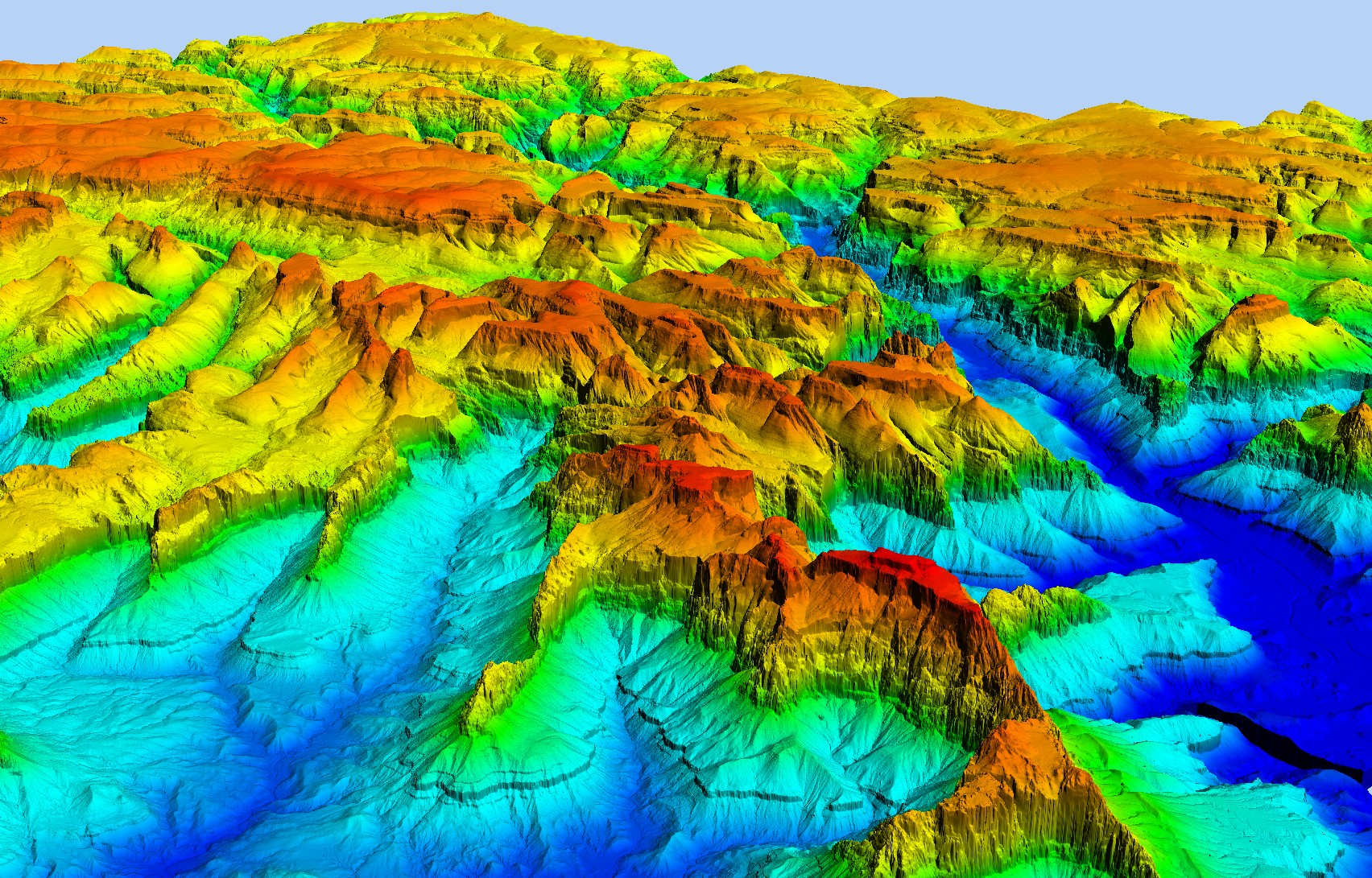
A raster file is used to store spatial data about a specific section of the surface of the earth (Fig. 1). Raster files consist in a rectangle-shaped image composed of several little squares of equal sizes (“cells”). You can think of actual image files (like a photo) and the pixels that compose it: in a photo, each pixel has a specific value for a color; when put together with all other pixels, all colors come together to form the image. The structure of a raster file is essentially the same, but in a raster file, each cell is associated with an area in space. Additionally, each cell stores a specific value that reference a consistent set of variables.

Source: https://desktop.arcgis.com
For example, Figure 2 shows a raster file for elevation in meters above sea level for New York City. This raster file will consist of the whole area of NYC divided in thousands of equal sized cells, each one with a number representing elevation in meters. Note that you can also store categorical values in a raster file (e.g., each cell could have a letter representing the borough it belongs to).

Now that we know the structure of a raster files, there are two features we need to think about when using raster data: the extent and the resolution.
The extent of a raster represents the geographic limits of that file, or what specific surface of the plane is that raster representing. The extent is always described with four values: the minimum and maximum longitude (also known as xmin and xmax) and the minimum and maximum latitude (also known as ymin and ymax). For instance, the raster file for the above example of elevation in NYC has the following extent:
- xmin: -74.26 (or 74.26 degrees west of the prime meridian)
- xmax: -73.64 (or 73.64 degrees west of the prime meridian)
- ymin: 40.48 (or 40.48 degrees north of the equator)
- ymax: 40.89 (or 40.89 degrees north of the equator)
In fact, any map of NYC would have this extent.
The resolution of a raster refers to the size of the cells. In other words, how much of the earth’s surface is that cell covering? That information can be given in either 1) the length of the side of the square; or 2) the actual area covered by the square. The unit can be in km or miles (or km2 or mi2), or, more usually, in actual degrees (i.e., unit we use to measure distances and pinpoint locations on a spherical surface). The resolution tells us how much variation we have for our variable of interest in that specific area of the globe (Fig. 3). If we have big cells, it means that a large area is being collapsed into one single value; therefore, we have less information (i.e., lower resolution). Alternatively, if we have four smaller cells that cover the same area that one big cell would be covering, now we have four different values for that area, and they can be slightly different from each other; that means we have more information (i.e., higher resolution). As a practical example, imagine elevation change in NYC. Imagine two locations, one at 10m elevation and the other at 40m, 1km away from each other. If we have one cell covering both location, we would need to calculate the average of both spots and assign this one cell the value of 30m (which is not bad, it’s a good compromised approximation of reality). However, if we have smaller cells (higher resolution), in a way that each location has its own cell, then we can assign different values and actually have a more realistic representation of the change in elevation from one spot to the other.

Source: https://desktop.arcgis.com
Two points on choosing extent and resolution: 1) it defines the amount of information you will have to answer the question you want or visualize/convey the information you want; 2) it will impact the size of the file and easy it will be to deal with it in a GIS application. Keep that in mind when looking around for raster files.
Quick intro to using raster files in R
Let’s take a quick look on how to work with raster files within the R language. Keep in mind that most of the steps we will see here can be used in any other GIS platform (QGIS, ArcGIS, python language, etc.). R is just one option among many to visualize and analyze spatial data.
In R, we use the raster package to work with raster files. This package contains several useful function to load, visualize and modify raster files. So let’s install it (if we haven’t it yet).
install.packages('raster')
Now we need to load the package…
library(raster)
… and use the function raster to load a raster file saved to our computer into our R session. Here, we are loading the raster of elevation across the world, from the WorldClim database.
Choices of resolution, representing the length of the side of each cell: 10 arc-min, 5 arc-min, 2.5 arc-min and 30 arc-seconds. To work with smaller file, we choose the 10 arc-min resolution, which is the highest length, therefore larger cells and lower resolution. One arc-min equals approximately 1.8 km at the equator. Therefore, a 10 arc-min resolution means our cell has a side length of 1.8 km * 10 = 18km. This means all elevation values within an 18km distance are collapsed into one single value. Also, note that one arc-min represents different lengths depending on the latitude you are. Here is a useful Arc2Meters converter that takes latitude into account.
# Notice the file extension is .tif, which is the extension
# for image files.

globe_elevation <- raster('wc2.1_10m_elev.tif')
The raster function loads our raster file into R as a raster object. We can see some information about that object if we just call it:
globe_elevation
class      : RasterLayer

dimensions : 1080, 2160, 2332800  (nrow, ncol, ncell)
resolution : 0.1666667, 0.1666667  (x, y)
extent     : -180, 180, -90, 90  (xmin, xmax, ymin, ymax)
crs        : +proj=longlat +datum=WGS84 +no_defs
source     : wc2.1_10m_elev.tif
names      : wc2.1_10m_elev
values     : -352, 6251  (min, max)
The information printed to the console show us:
- the class of the object (a RasterLayer);
- the dimensions (i.e., the number of rows, number of columns and number of cells composing this image);
- the resolution, which is shown in decimal degrees. In this case, 0.1666667, which means one side is approximately 0.166667 (or 16.66667%) of a degree (which is made up of 60 arc-minutes). If we calculate 16.66667% of 60 arc-min, we arrive at approximately 10 arc-min (the original resolution).
- the extent, also given in decimal degrees. Here, we see that xmin = -180 (180 degrees west of the Greenwich meridian), xmax = 180 (180 degrees east of the meridian), ymin = -90 (90 degrees below the equator) and ymax = 90 (90 degrees above the equator).
Other information include the projection (crs), the source, name of the layer and values in it (which we will cover in a separate blog post).
We can visualize that object in a map using the plot function.
plot(globe_elevation)

R uses a default color scheme to show the gradient of elevation across this dataset. Notice how the areas in green are the highest mountain range sin the globe (the Andes and the Himalayas).
Let’s focus on North America. We can use the function crop to modify the extent of our file. That function requires 1) the raster object to be cropped; 2) the extent to which it should be cropped. We give the extent as a vector in the order xmin, xmax, ymin, ymax. The numbers shown below were retrieved from a visual inspection of the coordinates (like in google maps, for instance).
north_america_elevation <- crop(globe_elevation,c(-141,-51,17,59))
Now let’s visualize our new raster:
plot(north_america_elevation)

As a final exercise, let’s try to plot a vector file on top of our raster file. For this, we will use a vector file with the states of a few countries in the world (US and Canada included), retrieved from the database Natural Earth. In the page linked, we have vectors of political boundaries across the world, one of them being Admin 1 – States, provinces, which is the one that we download.
Vector files come as a collection of files, one of them being a shapefile with extension .shp. Here, we will use the rgdal package to load our shapefile into R (make sure to install this package if you don’t have it yet).
library(rgdal)
states <- readOGR('ne_50m_admin_1_states_provinces/ne_50m_admin_1_states_provinces.shp')
To plot states on top of our raster, we first plot our raster object…
plot(north_america_elevation)
… and then we plot our shapefile object, using the argument add=T, which tells R to add our second plot on top of our first one.
plot(states,add=T)

And there you go: now we have a map combining information from both vector and raster files. One following step could be to extract elevation information per state and, as you’ve probably guessed, functions for such tasks are built within the raster package. That is something we will be covering in future posts about the raster package.

This entry is licensed under a Creative Commons Attribution-NonCommercial-ShareAlike 4.0 International license.


